Bringing What Plane to Android — Porting iOS to Material Design
Last updated: May 2026
When we launched What Plane for iPhone, the response was immediate and clear: people love having a home screen widget that tells them exactly what's overhead without opening an app. But the second most common question followed just as quickly: "When is Android coming?"
This article covers the journey of bringing What Plane to Android — the technical and design challenges of moving from iOS to Android, and why a direct port was never going to work.
Why Not Just Copy It Over?
On the surface, What Plane is a straightforward app: pull ADS-B data, show the nearest aircraft, display it in a widget. iOS and Android both have widgets, both have networking, both have location services. So why not just rebuild the same thing?
The answer comes down to design language. iOS and Android have fundamentally different visual dialects. What feels natural and intuitive on one platform feels alien on the other. A button that looks perfectly at home in UIKit will stand out as a sore thumb in Material Design.
The Visual Language Gap
iOS design leans on depth, translucency, and layered materials — the SF Pro typeface, smooth continuous curves, and a visual hierarchy built around vibrancy and blur. Android's Material Design is flatter, more deliberate, built around bold colour blocks, elevation via shadows, and the Google Sans / Roboto typeface.
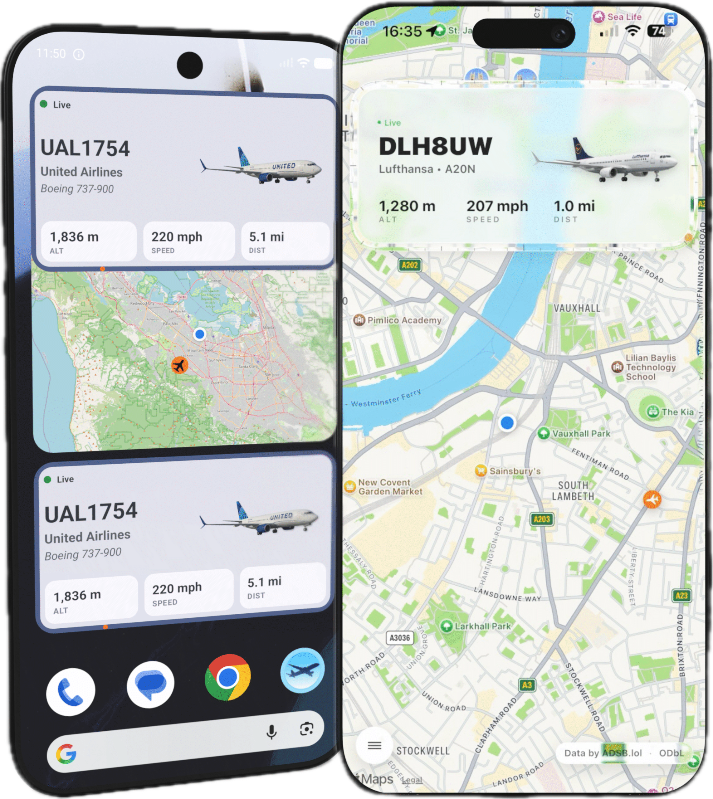
Take the widget. On iOS, the What Plane widget uses a rounded glass-morphism style with subtle gradients that mirror the iOS home screen aesthetic. Translucent backgrounds, compact layout, minimal chrome — it feels like it belongs on an iPhone.
![]()
On Android, the same information needs a different visual treatment. Material You widgets adapt to the user's wallpaper colours, use dynamic colour theming, and embrace more generous spacing. The Android widget needs to feel at home in a world of rounded squares, accent colours pulled from the system theme, and typography that follows Material's type scale rather than SF's.
Adapting the Core Experience
The heart of What Plane is its glanceability — the ability to look at your phone and instantly know what's overhead. On iOS, that means a single widget that shows the nearest aircraft with a compass bearing ring. On Android, it means embracing the home screen widget system more fully: support for multiple widget sizes, lock screen widgets on devices that support them, and adaptive layouts that work across everything from a foldable inner display to a compact phone screen.
The app itself follows a similar pattern. The iOS version uses a tab bar with translucent materials, large titles, and a navigation stack that feels natural with gestures. The Android version adopts a bottom navigation bar with Material's top app bar, elevation-based surfaces, and navigation patterns that match what Android users expect from first-party apps.
Technical Challenges
Beyond the visual differences, there are genuine technical hurdles:
- Widget refresh timing — iOS and Android handle background widget updates very differently. Android's WorkManager and iOS's background task scheduler have different guarantees and limitations.
- ADS-B data parsing — the same backend data feeds both platforms, but the rendering pipeline, state management, and caching strategies need to be platform-native (Swift/SwiftUI vs Kotlin/Jetpack Compose).
- Location permissions — both platforms have evolved their location permission models, but the dialogue flow and user expectations differ significantly.
- Screen size fragmentation — while iOS has a manageable set of screen sizes, Android spans everything from small phones to foldables to tablets, requiring a genuinely adaptive layout system rather than a few size classes.
Why It's Worth Doing
The core value of What Plane works on any platform: nearest-aircraft detection, instant glanceability, rich airline and aircraft detail. Android users deserve the same experience — built for their platform, not just transplanted from another one.
The Android version is currently in development. The visual language is being rebuilt from the ground up for Material Design, the widget system is being designed to feel native to Android home screens, and the app architecture is being rethought for Jetpack Compose and Kotlin.
It's not a port. It's a re-imagining. And that's the only way to do it right.
Related Articles
- The Best Plane Tracker App for iPhone (2026)
- What Is ADS-B Flight Tracking Explained?
- ADS-B Flight Tracking on iPhone: What It Is and How to Use It
- What Plane? — Aircraft Tracker
What Plane for Android is coming soon. Join the waitlist →